Making health data more accessible – a good news story from NHS England!

What sort of information do we need to influence local health systems effectively? Recently, I came across a good piece of work from Ipsos MORI that raises the bar for good quality accessible information for local activists.
Managing data
We are awash with data, its possible to get hold of useful information if people know where to look. However, finding the data is just the beginning. Too often it is presented in a way that makes it hard to use and interpret unless you have access to analytical expertise which most members of the public and local voluntary organisations don’t.
Not surprisingly much of this data is gathered by Government and national agencies so when we are trying to understand what is happening locally we usually have to look at national data sets and hope that this provides us with local information.
Here is a typical example of a national data set. I wanted to answer the question:
“How many homeless 16 to 17 year olds did Wakefield Council place into Bed and Breakfast in a given year?”
The web search “CLG Homeless Statistics” brings up the page “Homelessness Statistics”. Its a bit unclear where to go from here but a click on the sub heading “live tables” brings me to a page with over 30 spreadsheets and another sub heading “Detailed local authority level responses” a click on this takes me to a collection of 10 spreadsheets showing data by quarter.
I have arrived!
I open the most recent one and find that I am in a large spreadsheet with 8 pages and 330 or so rows (one for each housing authority in England) and some 50 or so columns. If you don’t want to download the spreadsheet you can get a feeling for its size from the screenshot below.

The data I want is in there – but I want a years worth of data – so will need to work my way through 4 of these spreadsheets.
I realise that digging out the Wakefield information is basic bread and butter work if you can use a spreadsheet.
My point is this is not easily accessible information.
Unfortunately providing information in the form of vast spreadsheets is the norm – have a look at the Health and Social Care Information Centre website it is littered with examples, here is one:
Provisional monthly HES for admitted patient care, outpatient and accident and emergency data April to September 2014

It need not be this way – there is something better.
For another piece of work I was doing I wanted to understand the following:
“How easy is it for people (by age) who work full time to get an appointment at their GP?”
I did a web search for the latest “GP patient survey” This took me straight to the delightfully simple GP Patient Survey Website which has been designed and maintained by Ipsos MORI on behalf of NHS England.
Clicking on “analyse the results” and then “Data Analysis” (this bit is not immediately obvious) takes me to a page where I can pick and choose what I want to look at – click a button and out pops a nice graph – answering my question!
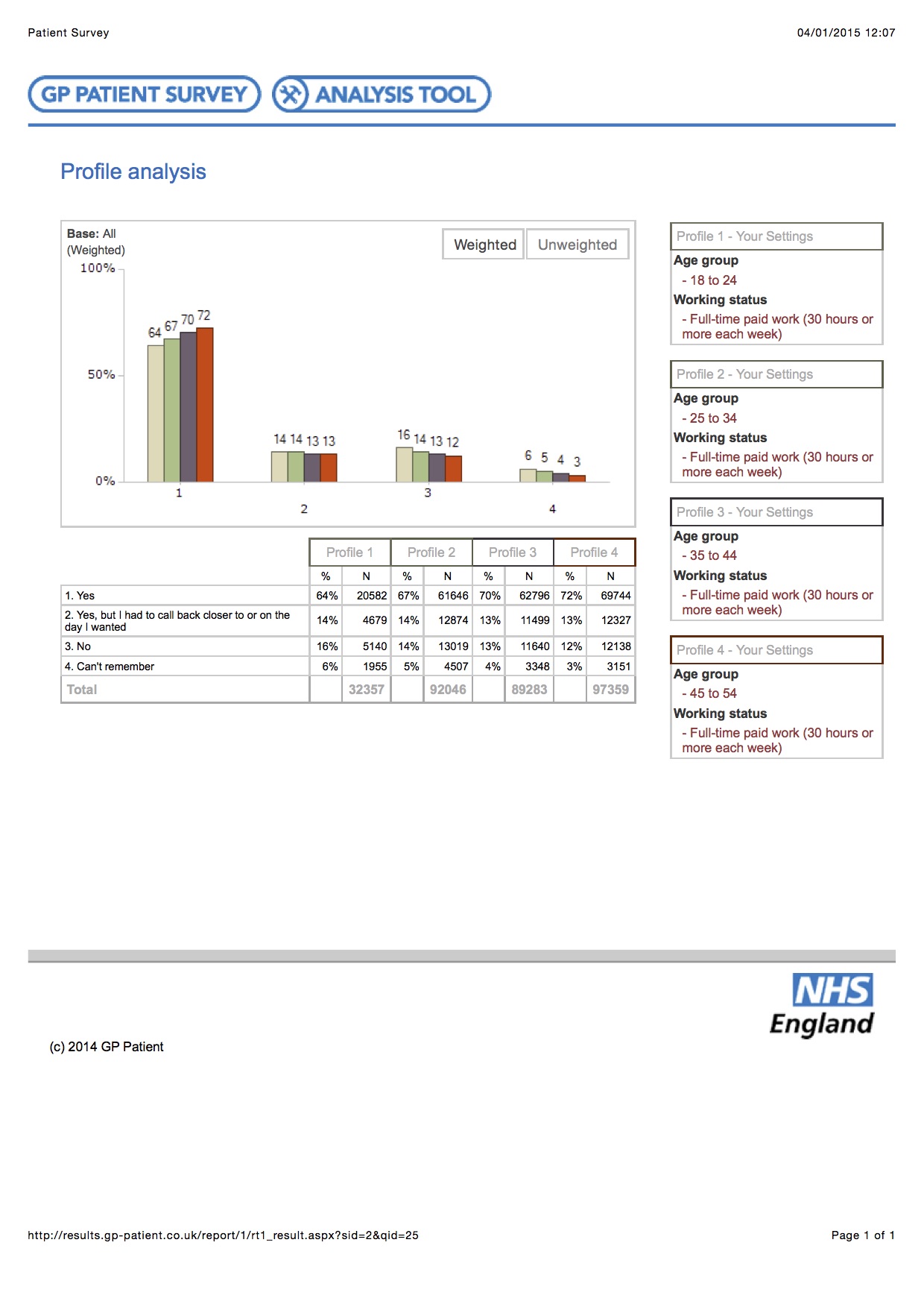
This is a completely different experience. Here there is a helpful interface that allows anyone to gather together data that reflects their area of interest – with the ability to choose a wide range of variables and compare and contrast areas.
It works quickly and apparently reliably. It is possible to produce easily understandable graphs that are clear and straightforward. Ok, I did have to produce 2 graphs to cover the entire age range – but my question is answered!
Credit and the Challenge
Credit to Ipsos MORI and to NHSE – I think I could even give Tim Kelsey a compliment here – first time in this blog!
The question for me is why is this approach not used more often – we should expect more government data to be available in this way. Of course this is also a local issue. If we are to make it easy for local citizens to engage with and influence local health and wellbeing systems then this sort of approach needs to be used more by CCGs, Local Authorities and those putting together Joint Strategic Needs Assessments.
I am sure that there are more good examples out there – if you know of any let me know!
What do you think?

Since I published this post Alison McFarlane has drawn my attention to some good interactive data sets produced by the Office of National Statistics which are available here – http://www.ons.gov.uk/ons/interactive/index.html
Mark
Hi Mark
I struggle with this every day and would love to see more done to make information accessible and therefore useful.
The Manchester Evening News have done a great job with the sprawling results of the GP patient survey making it relevant to the public http://www.manchestereveningnews.co.uk/news/health/greater-manchester-gp-surgery-ratings-7388951
What do you think?
There are some other good bits out there too. The CCG outcomes tool (http://ccgtools.england.nhs.uk/ccgoutcomes/html/atlas.html) is good and the PHE Outcomes Framework can be played with nicely (http://www.phoutcomes.info/public-health-outcomes-framework#gid/1000049/pat/6/ati/102/page/4/par/E12000004/are/E06000015) Sure there are others that I can’t find currently!
It would be great if sometime in the future a clever developer could produce a tool which enable similar data sites to be produced at scale and low cost for local areas, so citizens could scrutinise and tell the story of what is happening in their local places. Something like a combination between a JSNA and Tableau Public (http://www.tableausoftware.com/public/)
There have been some criticisms of the new gov.uk site which makes the front end easier to navigate but potentially at the expense of being able to find those boring detailed spreadsheets which are still important for proper scrutiny. Difficult to get both right it seems, but lots of promising new tools launched over the last few years!